There’s more to the market data than you think!
Market data can be analyzed in many ways to support investment decisions
4 of these methods were quite painful and complicated to carry out (until Chartoasis Sesame software came) though they could help a lot to make better investments.

1: What is the truth about Santa Claus Rally?
Investments often do not perform equally well in all months of year which is called calendar effect.
One may reasonably ask to what extent will eg.: ?Sell in may, and go away? or ?Santa Claus Rally? influence his/her given investment? Or is there an other period of the year that stands out?
A calendar effect chart like below may give the answer:
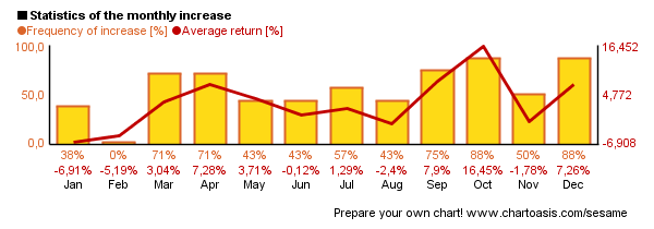
In the statistics of Google shares (above figure) one may observe, that December and October months have often yielded decent returns, while during February the shorting of Google shares seemed more deserving*.
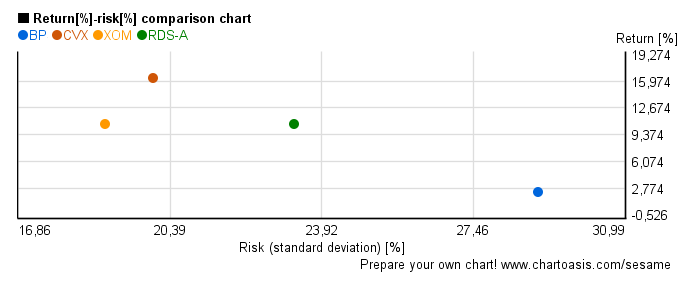
2: How much do You risk?
For a higher return you have to take normally higher risk – therefore one might ask: “Do I take the necessary risk only?“
Not every investment instrument pays the same return for the same risk. The wise investor strives to gain the highest possible return for the lowest possible risk.
On the chart below long term risk and return of similar investments (oil companies) can be seen. These investments can be compared to pick one that represents a balance between return and risk. (Investments in the upper left corner have less risk and higher return)
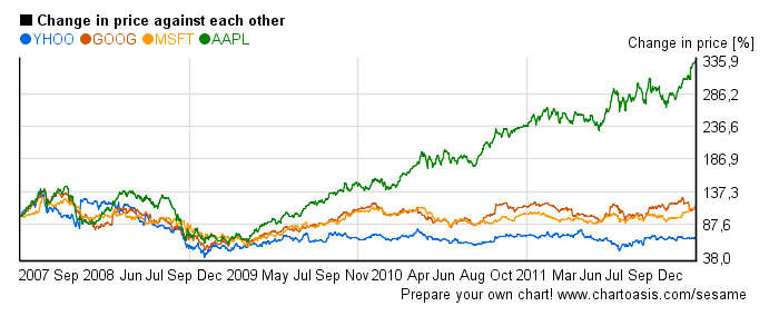
3: Which one do You choose from similar investments?
Which mutual fund or stock would you choose if they operate in the same country and business sector?
They rarely perform equally during the same time period. Differences can be rather significant!
Thanks to charts like below proper selection may be easier ? you can see which one outperforms or underperforms the others.
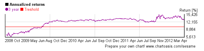
+1: Is it worth in the long run?
One expects that long-term investments result in more certain profits than short-term ones.
BUT: not all long-term investments realize equally steady returns!
How can one tell if an investment’s return was steady or not? A chart may help where each day’s long term return is shown.** [see below]
Sesame can even give an estimation for the chance that eg.: three-year returns will be greater than annual 10%** (See the treshold line. Ratio of return above 10% is 80% in the example!).
You can make this kind of charts with Sesame easily & free. Do not hesitate to use it – you can make better decisions with it!
*It must be noted however, that past behavior does not represent any guarantee in terms of future performance!
** 3 years’ return is annualized