When searching for the top performer stock mutual funds you mainly find rankings, which were prepared based on the returns of the last 1 year. As if nothing else would matter!
In reality, the following questions are absolutely just:
- Why should you choose the one, which was the top performer in the last 1 year?
- What if the good return of the last 1 year was just the result of a special luck?
- What if the fund showed no good performance before and will not perform in the future either?
- What if another fund will easily outrun it?
Beside the last 1 year return there are some other indexes, which are worth to examine:
- If the average return was high back for a long period of time, that is probably not the matter of luck.
- You make no harm either if you consider the best and the worst performance in a 1 year period of time.
If a table* is prepared from the maximum and minimum return of the 1 year time, some difference immediately shows up.:
| PRPFX | PXTIX | HWAIX | YAFFX | |
|---|---|---|---|---|
| Last return | 11.02% | 11.89% | 2.17% | 9.3% |
| Max. return | 25.47% | 76.71% | 77.63% | 75.03% |
| Min. return | -10.64% | -47.36% | -45.47% | -27.34% |
Better or worse?
Even the stock mutual funds with similar profile perform differently in the same period. The difference in the performances may be huge. Therefore it is important to make a good selection!
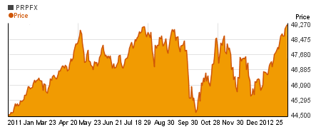
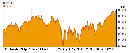
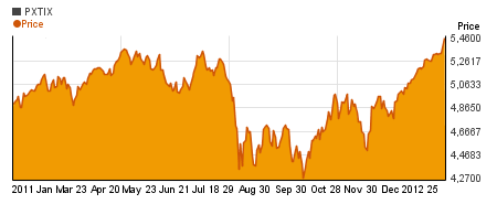
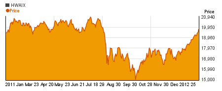
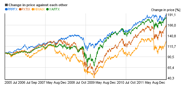
Sticking to the above example, it is useful to analyze in the chart below*, how the rate changed for Permanent Portfolio, Yacktman Focused, PIMCO Fundamental IndexPLUS TR Inst, Hotchkis and Wiley Value Opps Instl compared to each other. (The vertical axis shows the change in percentage against the rate located on the left side.)
Which stock mutual funds would you choose?
- The stock mutual funds, the curve of which is persistently above the other curves is probably a better performer and not only for the last 1 year for example.
- It's useful to prepare a similar figure* comparing the performance of the securities with other indexes. (Dow Jones, S&P500 etc.).
What about the risk?
Risk means that the actual return deviates from the expected return. For a higher return you have to take normally higher risk.
As to how much higher the return will be compensating the higher risk, it differs according to the kind of the investment. Not every investment instrument pays the same return for the same risk.
The risk has several assessment numbers. One of them is the standard deviation, which is calculated from the difference of the return from the average return. The smaller the difference from the average return is, the smaller is the standard deviation and the risk as well. (When comparing the standard deviations it is important to remember that the standard deviation of every security must be calculated based on the same amount of data!)
Why is the standard deviation important? As the return is with 95% probability within the standard deviation band of +/-2 around the average return. And it is not at all irrelevant how wide is the band, within which the return can change, is it? (If, for example, the average return is 15% and the standard deviation is 20%, then the return will be between 15-2*20 = -25% and 15%+2*20% = 55% with a probability rate of 95%.
In the chart below*, on the vertical axis you can see the 1 year average return and on the horizontal axis you can find the standard deviation showing the risk relating the stock mutual funds of the above example.
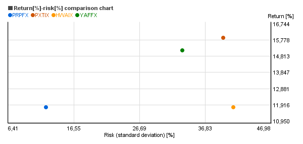
The wise investor strives to gain the highest possible return for the lowest possible risk. If, for example the yearly return of an investment changes between 11% and 13%, it is much better than an investment where the return changes between 2% and 22%. (The average is 12% in both cases, but the return is more uncertain in the second case.)
The points, where the high return goes with low risk are located around the upper left corner in the above chart. (Obviously, there are differences between the securities.)
The investments with low risk and high return are rare to find.
- When making the selection eg.: from Permanent Portfolio, Yacktman Focused, PIMCO Fundamental IndexPLUS TR Inst, Hotchkis and Wiley Value Opps Instl , the balance between the return and the risk should be aimed.
- Don't take extra risk without extra return.
- When the returns of eg.: two stock mutual funds are about the same, but their risk is considerably different, you should choose the one with lower risk!
*The above charts were prepared using the Chartoasis Sesame application. The data and the charts may not be up-to-date and they may not represent all the data available.
We suggest you to always use the latest data for your investment decisions. You can prepare similar charts easily on the www.chartoasis.com/sesame/start-sesame website.
The charts and the tables are based on the data of the past and they represent no guarantee for the future performance.