What can we see on the chart?
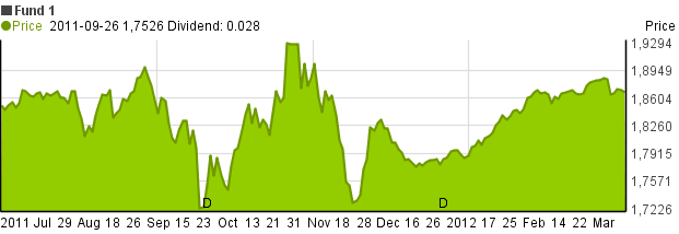
In the upper row of the header the name of the given investment is displayed.
The horizontal axis shows the displayed time range, the vertical axis shows the price of share / mutual fund / value of index.
Above the horizontal axis a letter “D” indicates the time of paying out dividends, if such information was loaded.
When possible (e.g.: having data from Yahoo! Finance), then the price of shares shown in the chart will be the price adjusted with dividends and split.
How can the chart be used?
- The time-range displayed on the graph can be set using the slider under the chart. The slider allows access to the entire downloaded time-range. For further information on the subject refer to the following link.
![]()
-
By moving the cursor on top of the chart, the second line of the title bar will display the date, the price of shares and (if applicable) dividends of the date the cursor is pointing at.